As a lover of retro video games, I simply had to have this. It now sits in the studio as my Toronto-time clock. And yes, it does make the "...waka-waka-waka..." pill-munching noise as its alarm. Just too cool!
As part of a Graphic News package ahead of the UK royal wedding of Prince Harry and Meghan Markle, I was tasked with creating an isometric cutaway diagram of St George's Chapel within the grounds of Windsor Castle. It turned out to be one of the most challenging illustrations of my career and took eight days to complete. There was not a great deal of good reference out there, so I had to mostly make do with satellite imagery, copies of old plans, a couple of interior 360° panoramas and tourist photos. The following 100 screen grabs show how I created it using Adobe Illustrator (images can be enlarged by clicking on them) . Step 1: Gather the most reliable research material Step 2: Draw as accurate a floorpan as possible — everything else depends on this being right Stage 3: Fold it into an isometric plane (strictly speaking this is not true isometric but an angle of my own liking) Stage 4: Start building the exterior — extruding
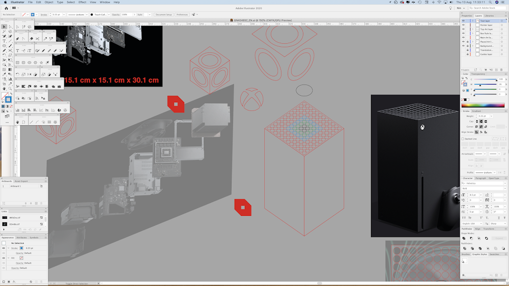
I should point out from the get-go that this is an Adobe Illustrator illustration and not an exact CAD model or precise render of the inner workings of the upcoming XBox Series X games console. Think of it more as an indication of how it works, based on the best publicly available images from Microsoft. It was a relatively tricky graphic to do and had some quite fiddly elements to create in 3D. Here is the abridged process in 10 screen grabs. The images can be enlarged by clicking them, if you wish. I begin by taking some screenshots from the XBox website that show the console's innards. I skew one image into an approximation of a flat, face-on viewpoint and proceed to draw components. These are the elements laid on top of each other – making sure they all fit together. Time to extrude elements into 3D shapes, using reference photos from the XBox website. All the, now 3D, elements laid on top of each other – making sure they still fit together. Now to work out how to pull them ap
It was a hectic 24-hours or so for newspaper graphic desks around the world as they frantically tried to illustrate just how U.S. Special Forces killed Osama Bin Laden in Pakistan early Monday morning (local time). I thought it would be interesting to pull together a bunch of infographics from newspapers around the world and see how they each treated the subject. It's been an enlightening exercise. Some titles ran the barest of locator maps or relied entirely on wire graphics, others reissued or redrew the official U.S. Defense Department SketchUp model (like I did), others just plainly made it all up, and one European newspaper appeared to be taking the mickey with a highly unusual page one Photoshop do-up. Have a look for yourselves and see what you think - starting in North America and working eastwards around the globe (clicking on a graphic will open a higher resolution image): The Washington Post, U.S.A. Los Angeles Times, U.S.A. Chicago Tribune, U.S.A. Houston Chronicle, U.S


Comments
Post a Comment